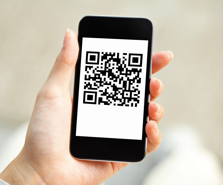
QR codes have become a ubiquitous part of our everyday life, linking the physical world with the virtual one. These square-shaped, black-and-white barcodes are more than just a technical novelty; they are powerful tools for marketers, designers, and product developers.
When used correctly, QR codes can significantly enhance the consumer experience, providing instant access to websites, videos, discount codes, and more. However, their effectiveness largely depends on their placement and size on the product.
Since the onset of the pandemic, QR code downloads have increased. The number of consumers in the United States who scan a QR code with their smartphone is expected to grow by 16 million between 2022 and 2025.
These scannable symbols, readable by smartphones, are essential for enhancing user interaction. They are becoming one of the go-to mobile marketing tools that brands are using to increase engagement. However, their effectiveness heavily relies on strategic placement and sizing. This article will look into the best practices for integrating QR codes into product design, ensuring they are both functional and aesthetically pleasing.
Understanding the Basics of QR Code Placement
While many people are becoming more familar with QR Codes, there are still many who have never scanned a code to see how easy it is for users and customers to engage with a brand online while in the real world. Business owners and entrepreneurs curious about how this works should learn how to scan a QR code on android or on an iPhone to test it out to see how easy it is.
Visibility is Key
The primary rule of QR code placement is visibility. The code should be placed where it is easily noticeable without overwhelming the product’s design. A common mistake is to hide the QR code on the back or at the bottom of the product, where it can be easily overlooked. Ideal spots are usually the front or sides of the product, depending on its shape and packaging design.
Context Matters
Contextual placement is equally important. The QR code should make sense within the product’s overall design and purpose. For instance, on a food package, placing the code near nutritional information can link to detailed dietary data or recipes. In contrast, on an electronic gadget, the QR code might be more appropriately placed near the manufacturer’s logo, linking to user manuals or warranty information.
Size: A Crucial Consideration
The size of a QR symbol is a balance between being noticeable and maintaining aesthetic harmony. If too large, it can overpower the product design. On the other hand, a too-small symbol may be overlooked or difficult to scan. The key is ensuring it’s large enough to be easily scannable from a typical user distance, without dominating the product’s visual appeal.
- Ensuring Optimal Scan-ability-Scan-ability is critical. Factors like color contrast, background noise, and symbol complexity affect scan success. A high contrast between the symbol and its background, such as black on white, is ideal. Avoid busy backgrounds or colors that blend in, as they can make scanning difficult.
- Integration with Design-Seamlessly integrating the symbol into the product design enhances aesthetic appeal. Designers often creatively incorporate these symbols into the overall design theme. For example, embedding it within a graphic element or using it as part of the artwork can make it an integral, yet unobtrusive part of the design.
- Location and User Accessibility-Consideration of the user’s ease of access is crucial. The symbol should be positioned where it’s easy for the user to scan, without the need for awkward angles or handling. This means avoiding placement on curved surfaces or corners where part of the symbol might be obscured.
Placement Tips for Different Types of Products
Consumer Goods
For consumer goods like food items, cosmetics, and clothing, QR codes should complement the product design. On packaging, the code should not disrupt the aesthetic but rather integrate seamlessly. For example, on a cereal box, place the QR code near the top or sides, where it catches the eye without covering key design elements.
Electronics and Gadgets
For electronics, the QR code placement should consider both aesthetics and functionality. It is wise to place the code on a non-removable part of the product, like the back or bottom, to remain accessible for troubleshooting or product registration.
Print Media and Advertisements
In print media, such as magazines and brochures, QR codes serve as bridges to additional digital content. Here, the code should be prominently displayed, often at the bottom or sides of the page, with a clear call to action prompting the reader to scan it.
Testing and Feedback
Before finalizing the QR code placement and size, it is essential to test it in various real-world scenarios. Conducting user testing and gathering feedback can reveal unforeseen issues with scanning or aesthetic integration. Adjustments based on this feedback can significantly enhance the overall product experience.
Conclusion
Incorporating QR codes into product design is a balancing act between functionality and aesthetics. The right placement and size of the QR code can turn it from a mere technical feature into a valuable asset, enhancing the user experience and providing additional value. By following these tips on placement and size, designers and marketers can ensure their products stand out in a crowded marketplace and offer an engaging experience to the consumer.


